Introduction
Seaborn is a data visualization library in Python that is built on top of the popular Matplotlib library. It provides a high-level interface for creating informative and attractive statistical graphics. One of the most useful tools in Seaborn is the clustermap, which allows us to visualize hierarchical clustering of data.
Hierarchical clustering is a common technique used in data analysis to group similar objects or observations into clusters. The clustermap function in Seaborn allows us to create a heatmap of our data, where rows and columns are reordered based on their similarity, and dendrograms are added to show the hierarchical clustering.
What is Seaborn?
Seaborn is a popular data visualization library built on top of Matplotlib. It provides a high-level interface for creating informative and attractive statistical graphics in Python. Seaborn comes with several powerful tools for visualizing complex data, including heatmaps, clustermaps, pairplots, and more.
One of the most useful tools in Seaborn is the clustermap function. This function creates a hierarchical clustering heatmap that allows you to easily visualize the relationships between different variables in your dataset. The clustermap function is particularly useful when working with large datasets or when you want to identify patterns in your data that might not be immediately obvious.
To use the clustermap function in Seaborn, you first need to import the library and load your data into a Pandas DataFrame. Then, you can call the clustermap function and pass in your DataFrame as an argument. By default, Seaborn will use hierarchical clustering to group similar rows and columns together based on their similarity.
The resulting heatmap will show the relationships between different variables in your dataset, with similar variables grouped together and dissimilar variables separated out. You can customize the appearance of the heatmap using various parameters such as the color palette, row and column clustering methods, and more.
Overall, Seaborn is an incredibly powerful library for visualizing complex data in Python, and the clustermap function is just one of many tools that it offers. If you’re working with large datasets or looking to identify patterns in your data quickly and easily, then Seaborn is definitely worth exploring further.
What is a Clustermap?
A clustermap is a type of heatmap that displays hierarchical clustering. It is created using the Seaborn library in Python. Hierarchical clustering is a method of grouping data based on similarity. In a clustermap, the rows and columns are sorted based on their similarity to each other, so that similar rows and columns are next to each other.
The clustermap function in Seaborn takes in a dataset and computes the pairwise distances between the rows and columns. It then performs hierarchical clustering on the rows and columns separately using agglomerative clustering. Agglomerative clustering starts by considering each data point as its own cluster, and then repeatedly merges the two closest clusters until there is only one cluster left.
The resulting plot shows the dendrograms for both the rows and columns, which represent the hierarchy of clusters. The heatmap itself shows the values of the dataset, with colors representing different levels of magnitude. The rows and columns are reordered based on their position in the dendrograms, so that clusters with similar values are grouped together.
Overall, a clustermap is a useful tool for visualizing patterns in large datasets. It can help identify groups of similar data points and reveal underlying structures in the data.
Creating a Clustermap with Seaborn
Seaborn is a popular data visualization library that provides a high-level interface for creating informative and attractive statistical graphics. One of the most powerful tools in Seaborn’s arsenal is the clustermap, which allows you to explore patterns and relationships in your data by clustering similar observations together and displaying them in a heatmap format.
To create a clustermap with Seaborn, the first step is to import the library and load your data into a Pandas DataFrame. Once you have your data loaded, you can use Seaborn’s `clustermap()` function to generate a clustered heatmap of your data.
Here is an example of how to create a basic clustermap using Seaborn:
import seaborn as sns
import pandas as pd

# Load sample data
data = sns.load_dataset("flights")
data = pd.pivot_table(data, values='passengers', index='month', columns='year')

# Create clustermap
sns.clustermap(data)
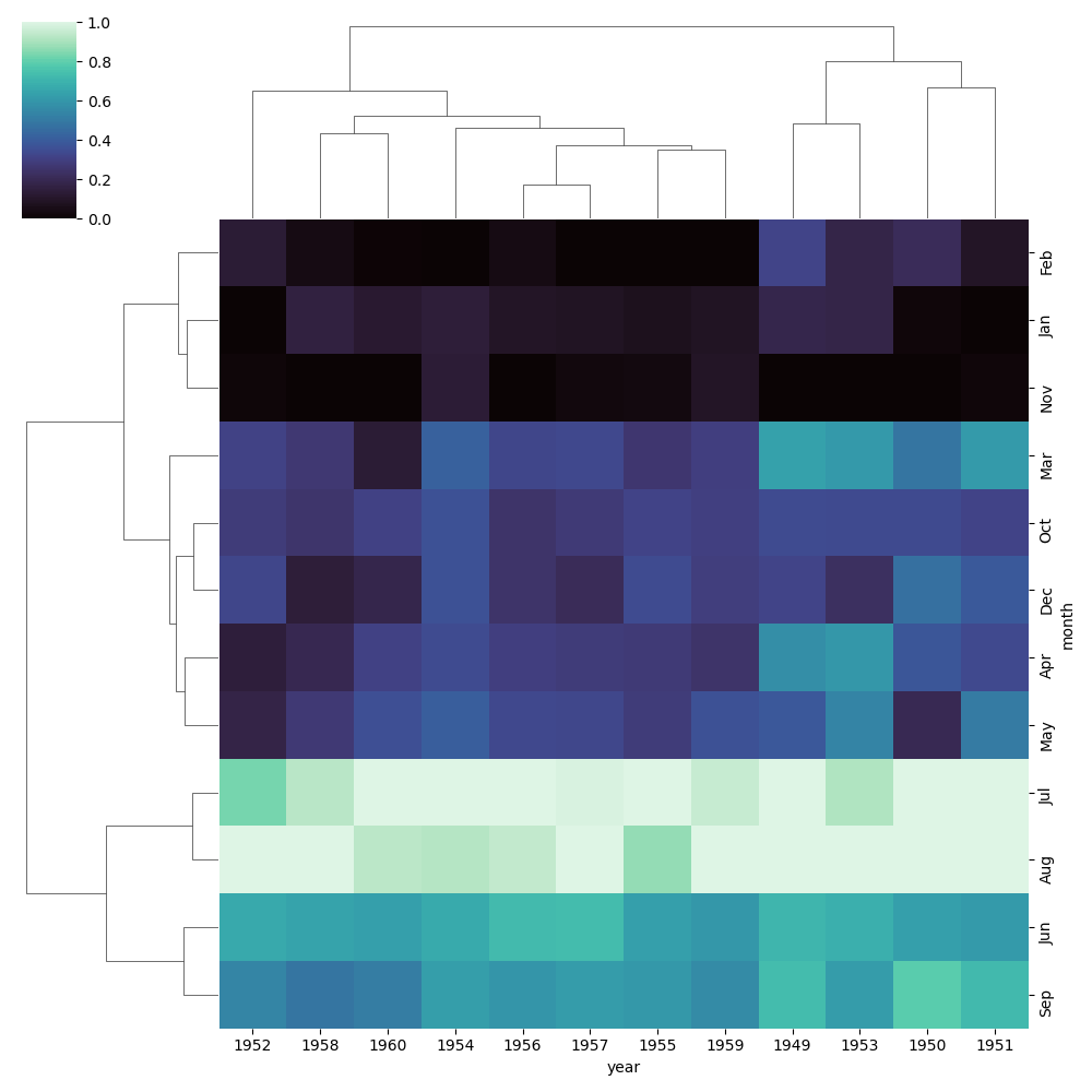
In this example, we are loading the “flights” dataset from Seaborn and converting it into a pivot table using Pandas. We then pass this data into the `clustermap()` function to generate our heatmap.
The resulting clustermap will display each row and column of our dataset as a dendrogram on either side of the heatmap, with similar rows and columns grouped together based on their correlation. The colors in the heatmap represent the magnitude of the values in our dataset, with darker colors indicating higher values.
Of course, this is just a basic example of how to create a clustermap with Seaborn. There are many options available for customizing your clustermap, including changing the color scheme, adjusting the clustering method, and adding annotations and labels to your plot. By experimenting with these options and exploring your data in different ways, you can gain valuable insights into patterns and trends that might not be immediately apparent from looking at your raw data.
Customizing the Clustermap
Once you have created a clustermap using seaborn in Python, you might want to customize it to make it more visually appealing or to better suit your data analysis needs. Fortunately, seaborn provides a wide range of customization options that can help you achieve this.
One of the simplest ways to customize a clustermap is by changing the color palette. You can use any of the built-in color palettes provided by seaborn or create your own custom palette using the color_palette() function. For example, to use the “magma” color palette, you can add the following line of code:
sns.clustermap(data, cmap="magma")
You can also adjust the size of the heatmap and dendrograms by specifying the figsize parameter. For example, to create a larger clustermap with a size of 10 inches by 8 inches, you can add the following code:
sns.clustermap(data, figsize=(10, 8))
Another way to customize a clustermap is by adding annotations to the heatmap cells. This can be useful if you want to display additional information about each data point. To do this, you can use the annot parameter and specify whether to display the actual data values or some other value such as correlation coefficients. For example:
sns.clustermap(data, annot=True)
You can also adjust the font size and style of both the dendrograms and heatmap annotations using parameters such as font_scale and font_styles.
In addition, seaborn provides several other customization options such as adjusting the row and column clustering methods, adding color bars for dendrograms or heatmaps, and more.
Overall, with seaborn’s flexible customization options, you can create highly customized clustermaps that effectively communicate your data insights.
Interpreting the Clustermap
The seaborn library in Python has a powerful visualization tool called clustermap that allows you to create a hierarchical clustering of data and visualize it in the form of a heatmap. The clustermap is an excellent tool for identifying patterns and relationships between variables.
In a clustermap, the rows and columns are reordered based on the similarity of their values. The dendrogram on the left side of the heatmap shows how the rows and columns are grouped based on their similarity. The colors in the heatmap represent the values of the data, with darker colors indicating higher values.
The clustermap also includes color bars on both sides of the heatmap that show the scale of the data being visualized. These color bars can be used to compare data across different clusters and identify patterns in the data.
It’s important to note that while clustermaps can reveal interesting patterns and relationships in your data, they should not be used as a definitive analysis tool. It’s always important to perform additional statistical analysis to confirm any findings from your clustermap.
Overall, with its ability to visualize hierarchical clustering and reveal patterns in large datasets, the seaborn clustermap is a powerful tool for data exploration and analysis in Python.
Conclusion
In conclusion, the seaborn clustermap is a powerful tool for visualizing hierarchical clustering of data. The clustermap provides insights into the relationships between variables and observations in a dataset. By using the various parameters available in the clustermap function, we can customize the appearance and functionality of the plot to suit our needs.
In this blog post, we have covered the basics of hierarchical clustering, how to create a clustermap using seaborn, and how to customize it. We have also explored some practical examples to illustrate the versatility of the clustermap function.
With this knowledge, you can use seaborn’s clustermap to explore your own datasets and gain valuable insights into the structure of your data. Whether you are a data analyst, data scientist or researcher, seaborn’s clustermap is an invaluable tool for analyzing and visualizing complex datasets.
Interested in learning more? Check out our Introduction to Python course!