The ROC curve is a valuable tool to measure the performance and then fine-tune classification models, as they show you the trade-off in sensitivity and specificity for a specific classifier at various thresholds. Despite this, some might find ROC curves difficult to understand.
In this post, we’ll aim to eliminate this difficulty by providing a simple explanation of what ROC curves are and how you should interpret them.
Don’t wait, download now and transform your career!
Your FREE Guide to Become a Data Scientist
What is the ROC Curve and what does it measure?
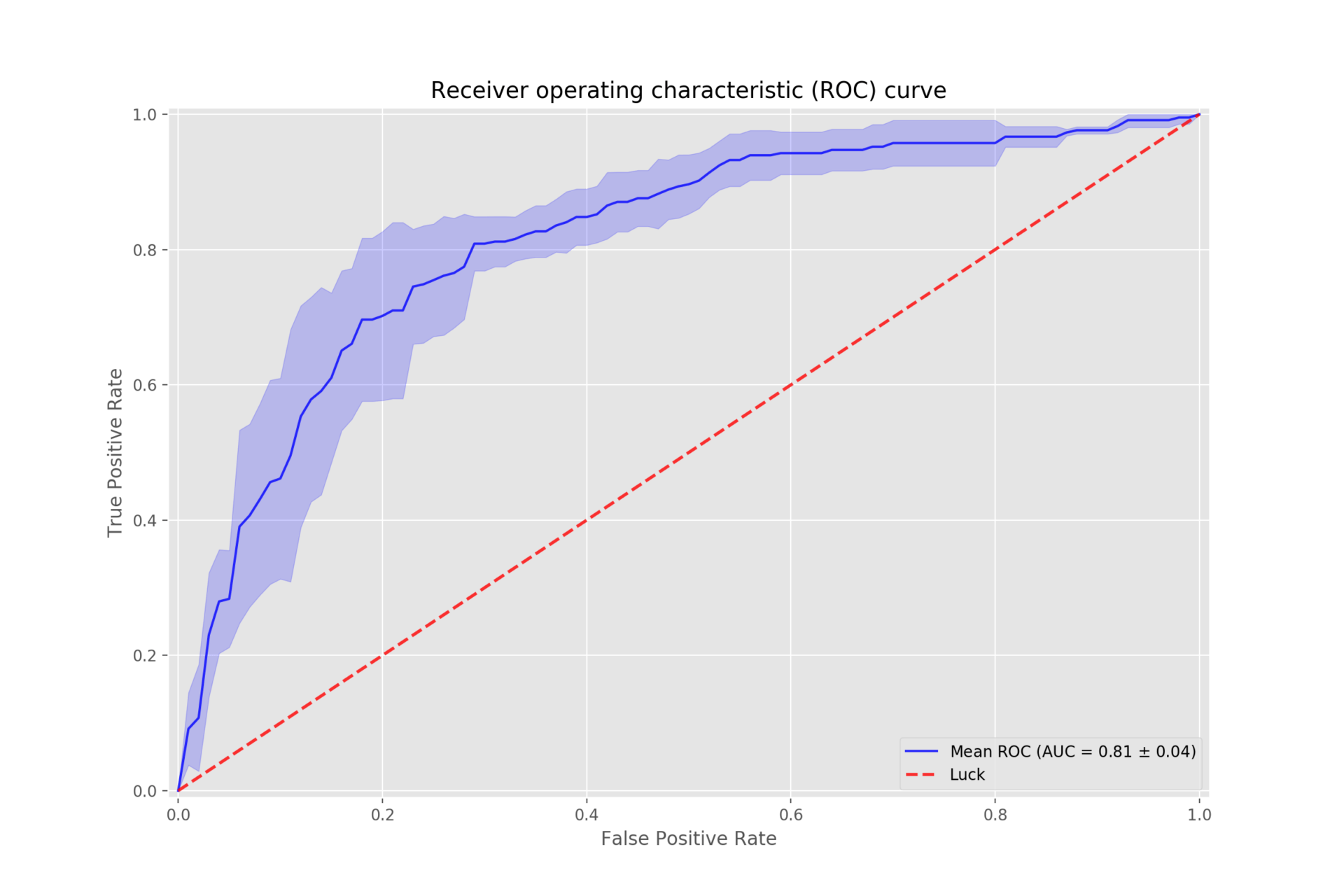
The ROC or Receiver Operator Characteristic curve is a graphical plot that shows you the diagnostic ability of binary classifiers. In simpler terms, the curve allows you to measure the performance of a classification model at all classification levels.
The curve was first developed for use in signal detection theory several decades ago, but it’s now commonly used in many other areas including medicine, radiology, machine learning, and more.
How do you read the curve and what does it tell you about your data set?
Before looking at how you would read the curve, there are two important concepts you need to know:
- True Positive Rate (TPR). The TPR is the proportion of observations correctly predicted as positive out of all the positive observations. The TPR is also known as the probability of detection or sensitivity.
- False Positive Rate (FPR). The FPR is the proportion of observations incorrectly predicted as positive out of all the negative observations. The FPR is also known as the probability of false alarm.
The ROC curve plots the TPR against the FPR at various threshold settings. This takes place in the ROC space that is defined by TPR and FPR as x and y axes and shows the trade-off between sensitivity (TPR) and specificity (1 – FPR). A diagonal divides the ROC space and results above the diagonal represent good results while results under the diagonal represent bad results.
As a baseline, a random classifier is expected to give you points on the diagonal of the ROC space, where FPR = TPR. The closer the plot is to the diagonal, the less accurate the classifier will be. For instance, guessing the result of a coin flip is expected to yield results close to the diagonal.
In fact, the more coin flips, the closer the results will come to an equal distribution of sensitivity and specificity. In other words, there will be a complete overlap between TPR and FPR. This is also known as a worthless test.
In contrast, the farther away the curve is from the diagonal of the ROC space, the more accurate the classifier will be. Thus, the best possible classifier will provide results in the upper left-hand corner of the ROC space. Here, there will be 100% sensitivity or only true positives and 100% specificity or no false positives. This is also called a perfect classification.
How can you use the curve to improve your data analysis process?
As mentioned earlier, the ROC curve enables you to analyze the performance of a classifier. In addition, there are a few other ways you can use ROC to improve your data analysis process. For one, when using binary classifiers that predict if an observation will be positive or negative, the probability ranges between 0 and 1. The default threshold is 0.5, but this isn’t necessarily always the best threshold.
When using ROC, you can increase or lower the threshold. For instance, when you lower the threshold, you’ll get more true positives. However, you’ll also get more false positives. Conversely, increasing the threshold too high can reduce false positives, but you’ll also reduce true positives. ROC enables to find the optimal threshold for your classifier that would provide the best performance.
Moreover, you can also use ROC to compare the performance of different classifiers. In this case, you’ll use AUC or Area Under the Curve that provides the aggregate measure of performance for a specific model across all thresholds. AUC thus gives you a single measure you can use to assess your classifier’s performance.
To use AUC, you’ll calculate the area under the ROC curve for different classifiers. There are several ways you can do this and, once calculated, you can compare the AUC for different models. The higher the AUC for a model or classifier, the better its accuracy and performance.
Are there any potential drawbacks to using the ROC curve in your research project?
Despite the advantages of using ROC curves in your projects, there are some drawbacks. For instance, the actual thresholds are typically not indicated on the plot and ROC curves work better with larger samples.
In addition, a ROC curve considers sensitivity and specificity as equally important and doesn’t account for misclassification cost. This is especially relevant in medical testing where poor sensitivity could lead to misdiagnoses while poor specificity could lead to over-testing.
How can you ensure that you are using the ROC curve correctly in your project?
To ensure that you use the ROC curve correctly for your project, you should follow the steps mentioned above to plot your observations. To get the most accurate results, you should also have an equal number of observations for each class.
This is because ROC curves provide an optimistic result if you have a dataset with a class imbalance. In other words, the performance of your model might be incorrectly assessed. Also, as mentioned earlier, you should not use ROC curves when you don’t value sensitivity and specificity equally.
In Closing
Now that you’ve learned a bit more about ROC curves and how to interpret them, we hope that you understand them better and can apply them to measure the performance of your classification models.
To learn more about data science and the range of courses we offer that can take you from beginner to expert, head over to our data science page for more information. At Pierian Training, we provide interactive, instructor-led training taught by technical experts in data science and cloud computing and offer practical and engaging on-demand video training content.